Case Study

Houston. It's Worth It. - The Beauty of Authenticity
I was a co-founder and principal of the marketing and communications firm ttweak for twelve years. One of our most successful projects came out of a Friday summer afternoon conversation with my partner, David Thompson, about how previous image campaigns for Houston had utterly failed to communicate the ethos of our beloved city. As the conversation progressed we compiled a list of aspects of living in Houston that everyone experienced even if typically unacknowledged, then we balanced that with a list of Houston’s undeniable positive offerings, and in ciphering the ratio of the good over the undesirable (what we came to call The Twenty Afflictions), the answer was, “Houston. It’s Worth It.” (HIWI), a wholly unintentional slogan which rapidly morphed into a grass-roots image campaign for Houston. HIWI birthed an online portal for Houstonians to share their love for the city; cheeky merchandise; a crowd-sourced photography exhibition; three crowd-sourced books; and a ready answer to the question outsiders seemingly always asked (with barely masked derision), "Why do you live in Houston?"
HIWI speaks volumes to the transformative potential of branding that embraces honesty and authenticity, creative tension, and a great deal of aesthetic consideration and sensitivity. Because we approached HIWI more as art making than marketing it left lots of space for its participating audience to expand, interpret, and re-envision what it meant. As a result it stayed fresh and vibrant with the constant potential to surprise and delight.
A Starting Point - The Twenty Afflictions
In discussing an approach to an image campaign for Houston it was agreed that honesty was paramount. This meant an acknowledgement of the most prevalent nuisances that make living in Houston challenging. We came to call these The Twenty Afflictions. They are: the heat, the humidity, the hurricanes, the flying cockroaches, the mosquitoes, the traffic, the construction, the sprawl, the refineries, the ridicule, the pollen, the air, the billboards, the flooding, the image, the property taxes, the short springs, the long summers, the potholes, the no mountains. We created iconic silhouettes for each of these afflictions and this stark graphic quality with a black and white palette became the foundation for all HIWI branding and identity.

Phase I - "Tell Us Why"
Once we'd solidified that list, we set about to create our first public-facing communication: a crowd-sourced blog in the form of a website. Visitors to the site were welcomed with a flash-driven, text-based animation of the afflictions accompanied by a banjo soundtrack and sound effects that referred to selected afflictions - a derisive laugh, the slapping of a mosquito, yodeling (a reference to the no mountains). The animation ended with a voice saying, "It's worth it," the Houston. It’s Worth It. logotype, and the invitation to “Tell us why."

Upon completion of the website, we sent an email to 100 friends and associates on our email list notifying them of a site we thought might be of interest, without giving attribution to the site's creator. Within a matter of days we had scores of comments on the site. That in itself was a pleasant surprise, but it was the poetic and passionate nature of the comments that indicated to us that we were on to something. And not only were the comments passionate, they were lengthy. We soon had to increase the character limit for the comment box as people were using up all the allotted characters.

The unexpectedly ardent response to houstonitsworthit.com encouraged us to find other avenues to promote the HIWI brand, so we produced merchandise.
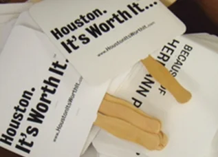
Merchandise
The Hermann Park Conservancy, an early supporter of HIWI gave us an opportunity to co-promote HIWI and Hermann Park at the park's reopening celebration after a major renovation. As this happened in early summer, we produced old-fashion hand fans, like those one used to find in churches or funeral homes. On one side of the fan was the website's URL and the Houston. It's Worth It. logotype with an added ellipses, and on the other, the words, "because of Hermann Park." Shifting the association from "in spite of," to "because of" allowed for us to co-promote with non-profits and other entities. These co-promotions were always represented graphically with HIWI's palette and typography. The choice of hand fans speaks to another strategy that we tried to use whenever possible: creating merchandise that in some way referred to one of the afflictions.
T-shirts were initial vehicle of choice to promote the brand. We produced one with just a list of the twenty afflictions, as well as the mosquitoes tee, the flying cockroaches tee, the flooding tee and the sprawl tee. We produced travel mugs with the traffic affliction; the mosquitoes caps; an umbrella in honor of the flooding; and as a gift for our friends in northern climates, an ice scraper with a quote submitted to the HIWI website: "You never have to scrape ice off your windshield before driving away in the morning."


Quotations gleaned from submissions to the "Tell Us Why" section of the website were also used in other ways. We produced a set of post cards with an affliction on the front, and a related quote taken from the website on the back. The flying cockroaches post card quote read, "What's a tad of humidity and a few cockroaches among friends." Along with honest acceptance, self-deprecating humor was a key attribute identified in the original conversation of what an image campaign for Houston should include.


Press
Houston. It's Worth It. garnered a great deal of publicity - both local and national. Stories on the campaign were published in the Houston Chronicle (once in the business section, once as an editorial); Boston Globe; New York Times; Los Angeles Times; Dallas Morning News as well as interviews on The Today Show and NPR. The campaign was publicly recognized in other ways as well. Rice University President, David Leebron referenced HIWI in his inaugural commencement speech. Dr. Stephen Klineberg's Houston Area Survey, a highly anticipated annual presentation to the Greater Houston Partnership, was titled, "Houston. It's Worth It."

Phase II - "Show Us Why"
After a couple years of steady sales of merchandise and activity on the website where Houstonians had told us why they loved their city, I became interested to see if they would also show us why. In an effort to find out, we teamed up with the Houston Center for Photography (HCP) to co-produce an event for their annual summer fund raiser. Written submissions to the website had been unexpectedly poetic, and we wanted to encourage Houstonians to submit photographic equivalents. To encourage this, we drew a distinction between images of Houston seen in typical convention bureau promotion and the idiosyncratic potential of the images we hoped our HIWI tribe would submit.

As an enticement to participate, we announced the possibility of publication in a book, though we were uncertain how many people would respond and of the quality of their photos, concerns that proved to be unnecessary. We received over 600 images, the great majority of which came from non-professional photographers, and hung every one of them salon style in the galleries of HCP. Once again, the community responded enthusiastically, with HCP breaking all attendance records over the brief weekend run of the show.


Phase III - HIWI, the Book
The book comprised images submitted to the HCP show as well as selected comments from the Houston. It's Worth It. website. This was a relatively early crowd-sourced book. Though the content of the book came from multiple contributors with widely varying aesthetics, the book was conceived and designed by one entity, providing a cohesive structure for the wide range of content within. HIWI was self-published and distributed, being available at Amazon, most bookstores in Houston, as well as several retail shops and even a grocery store (HEB). Over 20,000 copies have been sold and it's currently on its third printing.


Phase IV - HIWI:IKE
Considering that the entire campaign was funded from ttweak's coffers, which is to say barely at all, Houston. It's Worth It. was a remarkably well established brand by the time Hurricane Ike arrived in September of 2008. In the aftermath of the hurricane, we felt that a new book dedicated to Ike might be a positive and more vibrant record of the storm than traditional journalistic forms. Soon after the hurricane, we put out another call for entries, this time asking not only for photographs, but also journal entries, song lists, blog posts - all different ways of documenting the storm and its aftermath. Because of familiarity with the HIWI brand and the HIWI book's success, Houstonians had a strong sense of what kind of images we were looking for, and they responding in typically amazing fashion. Once we received the submissions and completed the book design, we used images and comments submitted to us to advertise the book. The voice of these ads is so unmistakably authentic and, again, Houstonians' self-deprecating humor shines through.


In conclusion
Houston. It's Worth It. holds innumerable branding lessons. It's main tenets - honesty, authenticity, and humor proved to be a winning combination. Authenticity is not something that can be manufactured, it can only be uncovered and accepted. Once this has happened, the truest and most efficacious expression of that authenticity, what it is to make a brand, reveals itself, and keeps revealing itself in different manifestations as the work continues. It is an approach very much akin to art making. This approach provides a space for the audience, like the viewer of a work of art, to participate in its creation; to bring their own perspective, ideas, and contributions, creating a vibrancy that lasts longer than a season, and a loyalty that no amount of money can buy.